
Hickey Stoneworks

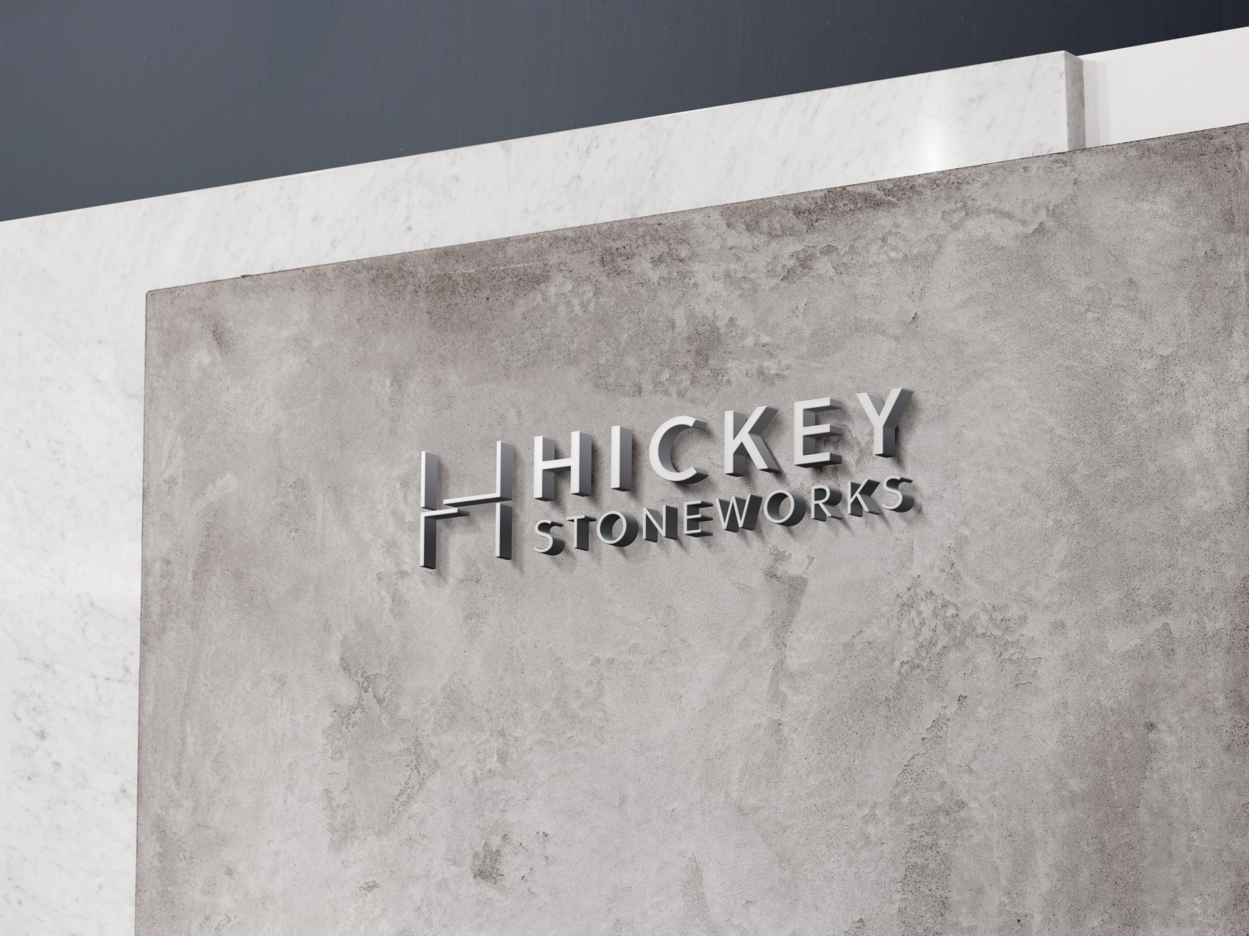
This concept is an evolution of the existing logo. We are aware of the company’s long standing history and reputation and the existing logo uses a strong ‘H’ to lead the branding. We have brought the ‘H’ into the year 2020, using a minimal, sleek custom ‘H’ to lead the new branding. The ‘H’ is a visual conjunction of the initials ‘H’ and ‘S’. This represents the art of the stoneworks which have both strong angles as well as skilfully created breaks and chiseled edges. It also reflects the angles and features of a room, for instance a kitchen fit-out. The ‘H’ is a bespoke, bold icon in itself and will work well as a distinguishable emblem even without the typography sitting beside it.
BRAND IDENTITY
Project
Task