The Student Centre at UCC
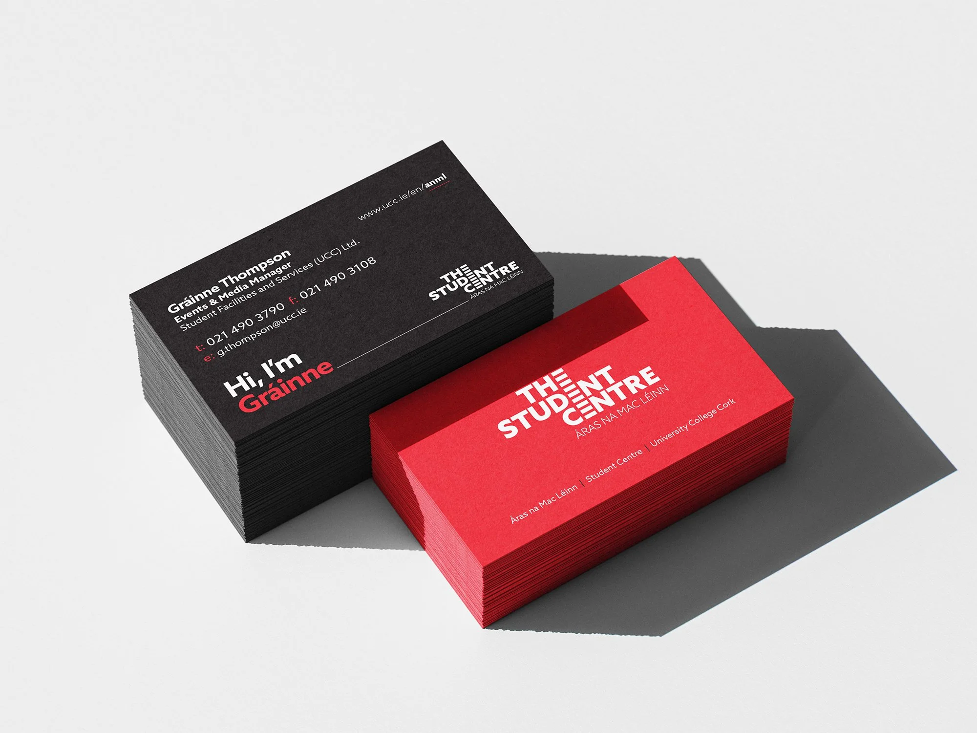
The visual identity for The Student Centre is built on bold, confident typography, designed to create a strong and memorable impression. At the heart of the logo is a unique treatment of the letter 'E'—a graphic alignment that evolves into a distinctive symbol of nine vertical lines. These lines represent the core aspects of The Student Centre, including retail, dining, hospitality, and more.
The logotype is structured across three stacked tiers, echoing the building’s three floors. This architectural reflection strengthens the connection between the brand and its physical environment, resulting in a timeless and instantly recognisable identity.
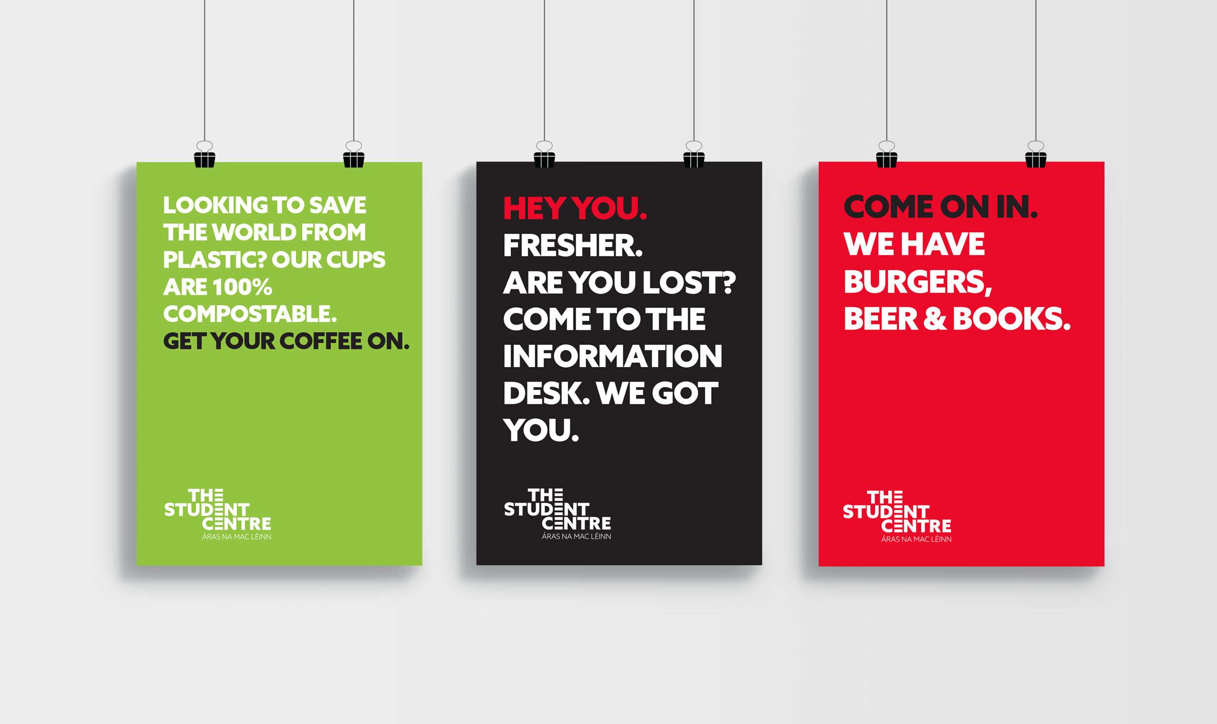
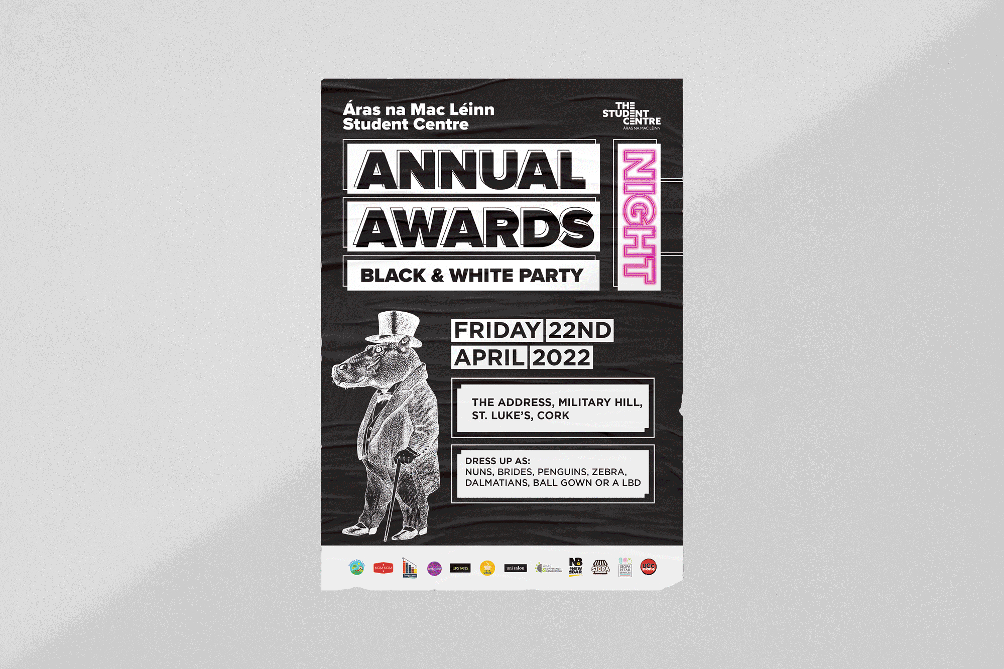
Our ongoing partnership with The Student Centre has led to the development of numerous campaign materials and event collateral, reinforcing the brand across every touchpoint.
BRANDING / INTERIOR DESIGN / SIGNAGE /