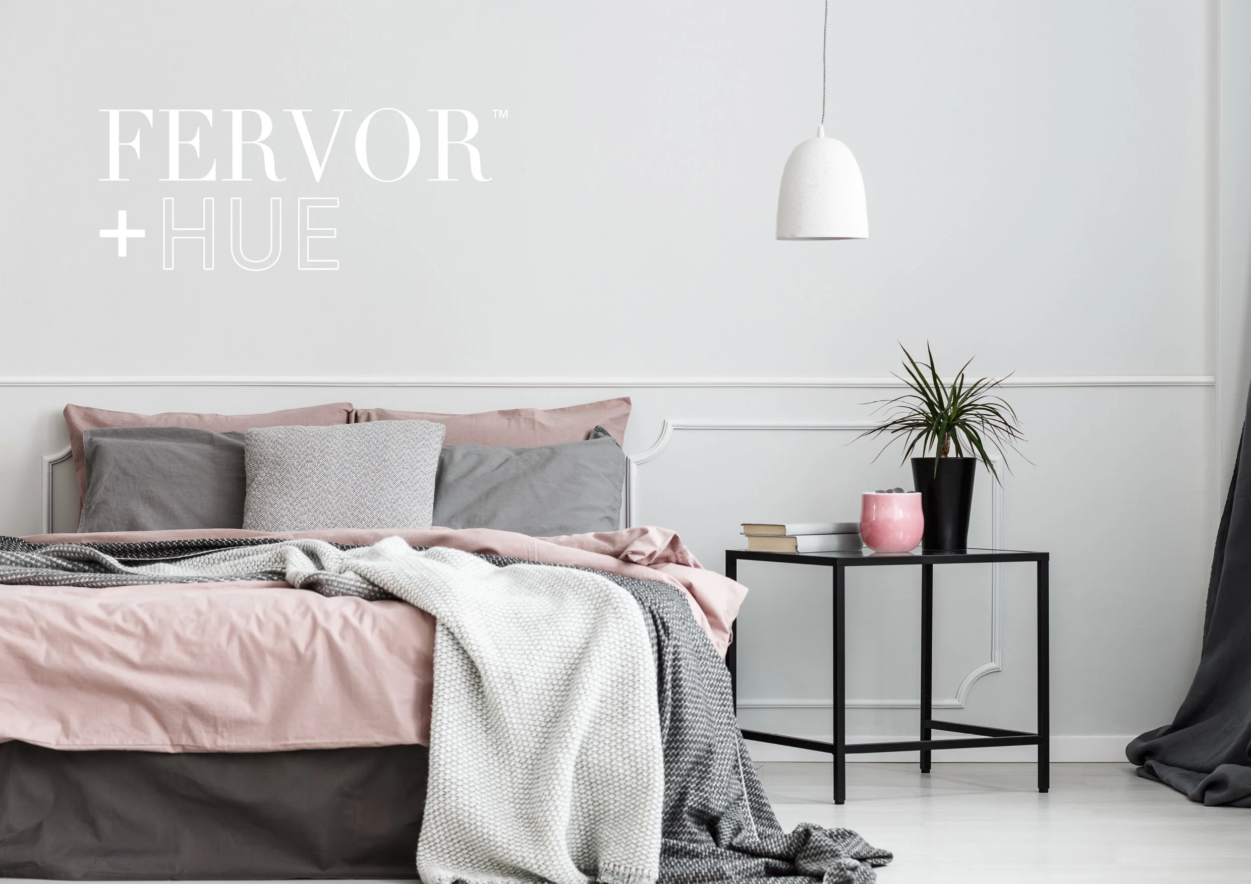
Fervor + Hue
BRAND IDENTITY
We wanted to create a fresh, contemporary brand identity that would reflect the quality and style of the products sold at Fervor + Hue. The company name itself means passion and colour, which is why we chose a dark grey and white for the identity colour palette. This means no matter where the logo is situated, for example on the website or a brochure, it will complement the colourful items in the accompanying photography and not distract from the product. The simple use of typography is strong enough to support the brand without taking the main focus.