Prime Letting & Management Ltd

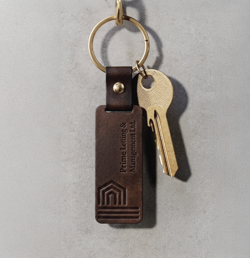
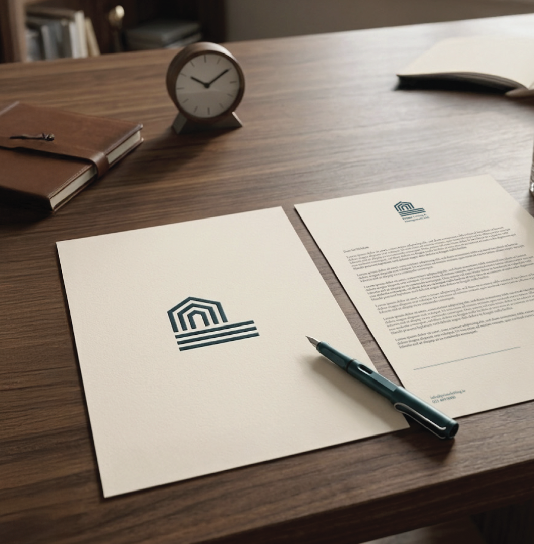
Prime Letting & Management Ltd. required a reimagined brand identity to reflect their premium service and deep expertise within the Cork real estate sector. The identity draws from architectural forms, translating the letter “P” into an elegant archway anchored by three foundational lines that symbolise structured stability and corporate reliability. Moving away from expected corporate tropes, the visual system pairs a commanding dark teal with soft cream and subtle mint tones to balance authority with approachable luxury. The project encompassed brand strategy, visual identity development, and brand positioning. Resulting in a timeless and striking presence, the new identity successfully communicates trust and cements their standing as Cork’s premier residential letting specialists.
Rebrand / Art Direction / Brand Strategy / Visual Identity / Brand Positioning